
The Art of the Underpainting
The Underpainting…
It is less of a necessity and more so a personal preference of the artist. Underpaintings are most commonly used to establish values according to a particular light source or to create a warm or cool undertone based on the color used. For me, the underpainting serves as a foundation layer to establish my values as well as key elements of my piece such as my subject of interest which I usually start with followed by the supporting details. Underpaintings can range from very basic and simplistic, only establishing shapes, shadows, and highlights, to very detailed and complex with fully developed forms and features. It really all depends on how much time you are willing to put into this foundation layer but as I mentioned above, it is not a necessity. You can still achieve an amazingly realistic painting without doing an underpainting first, however, from personal experience I have found that establishing this foundation makes for an easier process when adding color down the line.

The key thing about an underpainting is that it is usually monochromatic, painted using either a grayscale or a color scale. By taking the focus away from color and narrowing it down to value, shape, and form, painting your composition becomes way less intimidating. Personally, I opt for either burnt sienna or burnt umber light for my underpaintings because they serve well as undertones for my figures which usually have darker skin tones. Although, burnt sienna can be tricky due to it’s reddish tone which can appear quite heavily in photographs of your paintings. This can lead to difficulty during color corrections if you are planning on reproducing your work as a print. Therefore, I would lean more towards choosing burnt umber for a more neutral brown but any color that complements the chosen color palette of your painting will do.
By taking the focus away from color and narrowing it down to value, shape, and form, painting your composition becomes way less intimidating
A color scale, similar to a gray scale, shows the transitions of one color from light to dark by adding either white or black to that color. In the case of burnt umber, it is a pretty dark color by itself so I use that as my #5 value which is my darkest shade. I then place four dollops of white paint on my palette to mix values 1-4 (Rule of thumb, It is more effective to add color to white than white to color). Now, why do I make only five values you ask? Well, honestly, there is no rhyme or reason for me choosing that number, just seems like a reasonable amount to me. You can make more values or less because you will be blending them together anyway to achieve smooth gradients in your painting. You just want to make sure that your range of colors includes a light, medium, and dark value.

I strictly use acrylics when creating my paintings which means I experience faster drying times and less maintenance in comparison to oils. I use a variety of brands of acrylics that range in quality and price from Basics to Winsor & Newton but I have really come to enjoy Golden Heavy Body Acrylics which has very rich pigments and a smooth application. I used the Golden Acrylics paint in burnt umber light and titanium white to do my own rendition of the classic sphere exercise to demonstrate the use of the color scale in a blended and non-blended technique. The beauty of acrylic paint is its versatility and workability which is why it is my medium of choice when it comes to painting. When working with acrylics, you want to keep in mind another one rule of thumb: paint from dark to light. This is a sure way to maintain a smooth transition of values as you paint your forms. Acrylic paint dries to an almost plastic-like finish and depending on the thickness of the layers of paint you applied, you can distinguish those layers and see which one is on top of the other. Therefore, to not only achieve the appearance of realism but also the construction of realism, your lighter values should almost always be on top of your darker ones. Lighter values bring things forward while darker values push things back.
It’s all about finding a source of comfort in all the chaos and getting in that artist zone and then eventually everything comes together in harmony.

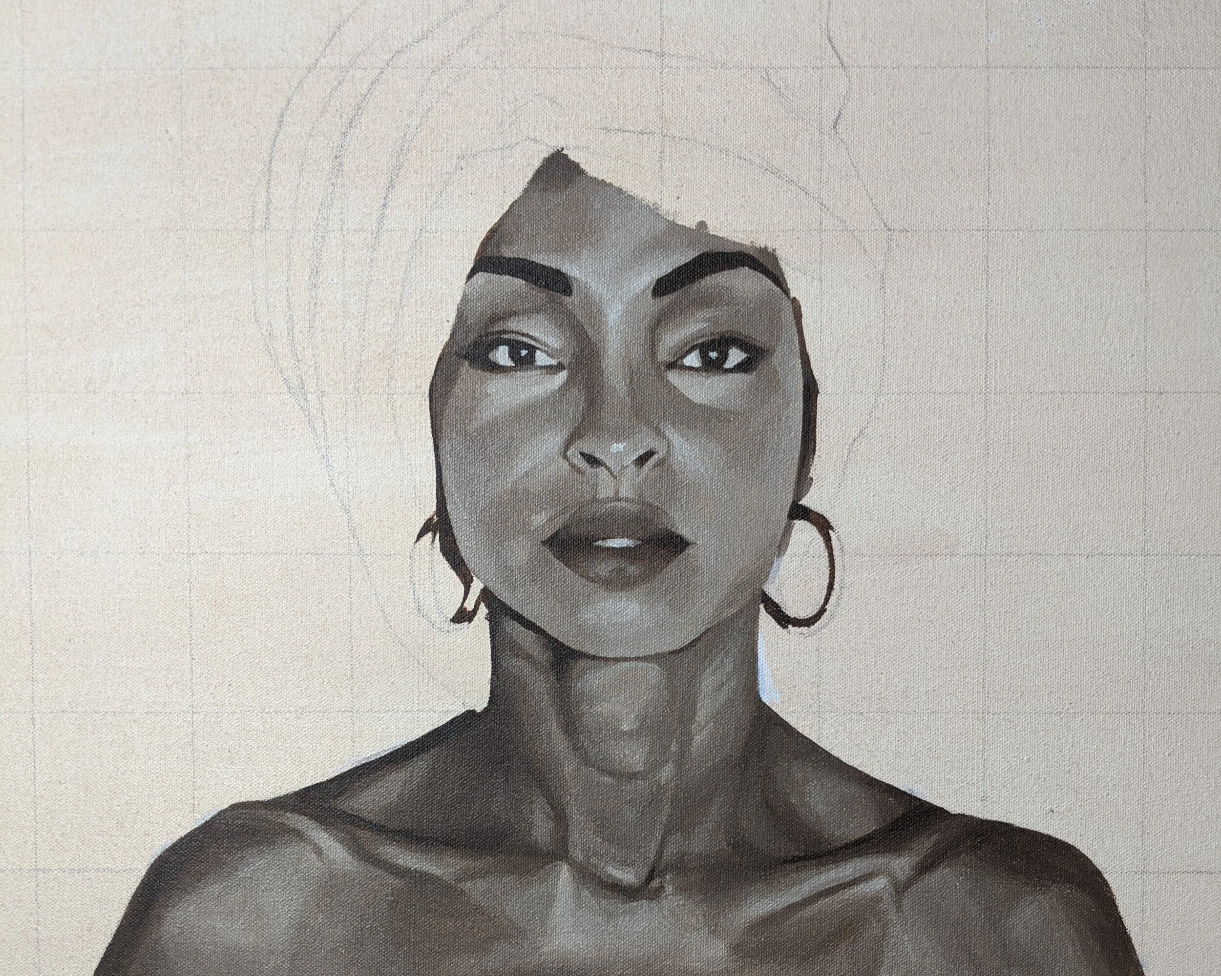
When creating my underpainting, I like to approach it in a more “sculptural” way. I take my largest brush, which is usually my #6 filbert brush, and I “sculpt” out the basic shapes and shadows using a wash of my darkest value. I then move on to my smaller brush, either a #2 or #1 round brush, to define the features and make those larger shapes become smaller ones with more distinct appearances. Once I have those features set in place, I begin to find and build the forms by painting in my lighter values from dark to light in order to give the illusion that my shapes have a three-dimensional structure, like in the sphere exercise. This last step of this three-step “sculptural” process takes up the bulk of any portrait underpainting because it takes time and strategic placement of values to get your forms just right. For me, this last step of building my forms becomes very meticulous and almost tedious at times as I become lost in all of the values and can no longer see a clear path forward because all I’m doing is adding values. I find myself looking at my painting and becoming unhappy with its progression because it may be a little messy and all over the place with how I applied my values and may not look like anything I was hoping for. Nonetheless, I keep going. If I start to feel overwhelmed at this stage I step away from it and return when I’m more motivated or I start to focus on smaller areas, like the eyes, nose, or mouth, and build outward. It’s all about finding a source of comfort in all the chaos and getting in that artist zone and then eventually everything comes together in harmony.

